Design System
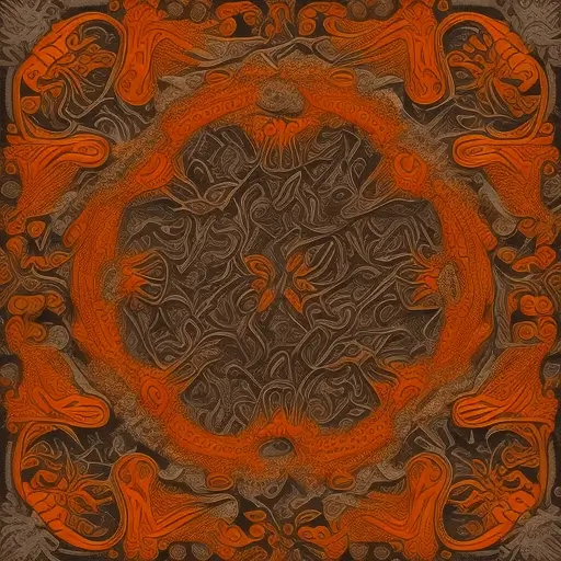
Generated via Stable Diffusion using DiffusionBee, the Openjourney model, and this prompt:
mdjrny-v4 style, gorgeous (floral) and filigree patterns prominently featuring (orange)
From what I've tasted of desire
I hold with those who favor fire
Color
This color palette is the basis for my new personal branding, based on orange because it has always been my favorite color. This implementation is designed to maximize use of new color spaces in CSS. The capstone is torch‑plasma which, on a supporting display, is the most vibrant neon orange that CSS can presently produce.
I knew I wanted a dark theme as my default because it is my preference. It also lets the orange pop more. I took inspiration from the grayscale-with-orange-accent schemes common in many text editors, but I wanted something more harmonious than the sterile grays they often use. To support that, I added the very warm gray torch‑soot as my background color. All the other colors were developed as needs arose for them, and the naming scheme came later.
torch-lighttorch-glowtorch-halotorch-flametorch-plasmatorch-warmthtorch-woodtorch-smoketorch-soottorch-ashTypography
The display font Oregano is used for h1 and h2 elements. It was chosen for its horizontal compression and its resemblance to the font used in my standard logo, Engagement, but with drastically increased legibility. It does not have font weight variants, but we can fake it with text shadow like this bold weight and this black weight. Additionally, iOS and Android will render the font with a synthesized bold weight which stacks with the text shadows.
The font M PLUS Rounded 1c is used exclusively for the ≫ glyph within Oregano text, because Oregano doesn't support it. Character-level subsetting is used to retrieve only this character from the CDN, costing only about 1kb total between the font file and style sheet. See this in action in this blog post's title.
The font Nunito Sans is used for everything else. We include bold, italics, and bold italics. The font was found via fontjoy which I have used for many years to create font pairings. This one was chosen for its straightfoward treatment of numbers and capitals, its ability to distinguish I/l/1 and O/0, and its ample width which aides in reading long form content and contrasts with the narrow display font.
On mobile, paragraphs are justified and have hyphenation enabled to handle excessive ragging. Above that, paragraphs revert to normal except the base font size is increased to 1.125rem (18px) for leisurely reading.
Elements
Heading Level One
Lorem ipsum dolor sit amet, consectetur adipiscing elit. Mauris elementum justo sit amet orci vestibulum fringilla. Mauris iaculis magna vel lectus cursus, sit amet accumsan ipsum tincidunt.
Heading Level Two
Nullam rhoncus at ex ut rutrum. Proin dapibus semper foo bar baz lectus, at imperdiet ipsum finibus nec. Curabitur faucibus vitae nunc in tristique. Integer nec elit vel dolor placerat feugiat.
Vestibulum tempus bibendum odio, scelerisque lobortis libero pellentesque non. Fusce nec fermentum ante.
Aliquam at ante ut metus tempor tempus. Praesent purus est, viverra sed consequat at, rutrum sed lorem. Pellentesque vel sapien ut arcu accumsan interdum. Proin tincidunt nisi venenatis magna vehicula, ut accumsan libero euismod. Vivamus ultrices augue consequat eros scelerisque, id vestibulum augue pretium. Fusce vulputate turpis id arcu volutpat convallis.
Heading Level Three
Maecenas egestas odio in fermentum lobortis. Sed sit amet purus efficitur, fermentum nibh in, vulputate quam. Orci varius natoque penatibus et magnis dis parturient montes, nascetur ridiculus mus.
- Nullam rhoncus at ex ut rutrum.
- Proin dapibus semper lectus, at imperdiet ipsum finibus nec.
- Curabitur faucibus vitae nunc in tristique. Integer nec elit vel dolor placerat feugiat.
Suspendisse venenatis arcu purus, in ullamcorper lectus pretium nec. Sed finibus semper dui. Morbi vitae elementum lacus. Donec lectus lorem, facilisis interdum ullamcorper vel, facilisis eu leo. Mauris nec nisl turpis. Donec feugiat semper libero, quis varius turpis pretium id.
Heading Level Four
Quisque quis arcu ac nunc laoreet tincidunt vehicula ac ante. Maecenas ac aliquet neque, ut mollis est. Mauris varius sapien viverra risus efficitur faucibus.
- Nullam rhoncus at ex ut rutrum.
- Proin dapibus semper lectus, at imperdiet ipsum finibus nec.
- Curabitur faucibus vitae nunc in tristique. Integer nec elit vel dolor placerat feugiat.
Etiam facilisis, eros id faucibus porta, quam massa tincidunt ex, sed condimentum magna nibh ac felis. Aenean posuere, urna non rhoncus sodales, leo augue tincidunt turpis, et tempus nulla metus eu metus. Cras quis egestas libero. Vivamus molestie et diam ut tincidunt.
Heading Level Five
Maecenas tincidunt orci sapien, quis posuere metus posuere vitae. Nullam posuere in nulla nec tincidunt. Etiam erat mauris, tincidunt eget nisl cursus, pulvinar vehicula velit.
Lorem ipsum dolor sit amet, consectetur adipiscing elit. Mauris elementum justo sit amet orci vestibulum fringilla. Mauris iaculis magna vel lectus cursus, sit amet accumsan ipsum tincidunt.
Components
<Skewer>
An <h1> with centered text in the display font (Oregano) flanked by horizontal lines. Dynamically adjusts margins and padding to account for descenders.
Props
top- Either a percentage nudge or an object with responsive percentages.
Examples
<Skewer>Skewer
<Skewer>with descenderspjygqR
<Pic>
A pure CSS widget that wraps an <img> and uses the checkbox hack to toggle an overlay housing an image caption. This provides room for a longer-than-usual caption without cluttering the screen, and acts as a surprise-and-delight reward for UI exploration. It has a button in the bottom right with the info icon to toggle the checkbox, triggering the overlay and switching the button to an "on" state featuring torch‑plasma .
Props
desc- the image captioncolor- the color of the overlay and border.DarkColoronly.show- force showing the overlay. Useful for debugging.imgClass- extra classes to apply to the image element directlycardClass- extra classes to apply to the overlay card
Examples
<Pic src="/about/design.webp" color="smoke" desc={...}>Lorem ipsum dolor sit amet, consectetur adipiscing elit. Mauris elementum justo sit amet orci vestibulum fringilla. Mauris iaculis magna vel lectus cursus, sit amet accumsan ipsum tincidunt.
<TierTile>
The Char component is used to display a single character in a particular color palette. It comes in many premade flavors for displaying tier ratings and unrated indicators. This documentation showcases the TierTile variant.
Props
rating- The tier rating, S through F
Examples
<Char.TierTile rating="S">STIER
<PostTileSet>
A 1-column grid of <PostTile>s.
Props
posts- An array of objects describing blog posts.headingLevel- The heading level to use for the post titles. Defaults to 3.filled- Whether to fill the background. Defaults to false.
Examples
<PostTile.Set posts={[...]} />
<ReviewTileSet>
A 3-column grid of <ReviewTile>s for any media type.
Props
media- An array of objects describing media reviews.
Examples
<ReviewTile.Set media={[...]} />